Whole Foods App Redesign
A from-scratch reimagining of the Whole Foods mobile app.
My Contributions
Feature 1: Navigation Bar
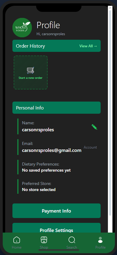
One of the prominent pieces of the app is the navigation bar located at the bottom. A feature common in many apps, it allows users to quickly reach some of the most important screens inside of the app.

Feature 2: App Flow
My other main focus during the development of the app was the flow between screens, most of which was determined during the Figma prototype creation.

Feature 3: Login/Registration
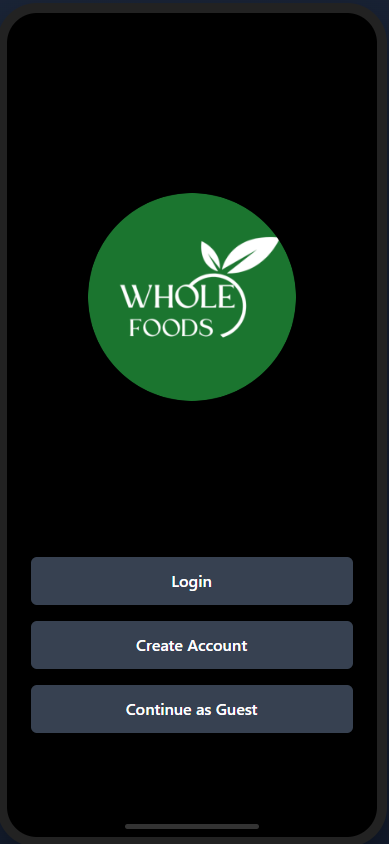
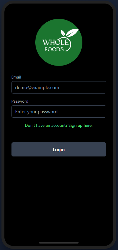
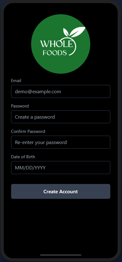
Of course, this app wouldn't work without user accounts. The starting point of this app is the onboarding screen, which allows users to either login, create an account, or continue as a guest.
My Journey
What I Learned
• Figma Prototyping
• Supabase integration and setup
• Further Javascript experience
• User Testing and feedback analysis
Challenges Overcome
A lot of the issues that I ran into were visual issues. Our plan to create a sort of mock phone display to be viewed in a browser seemed good, but there were some initial humps to get over with making it look right. This took some trial and error, just playing around with different possible solutions and figuring out which one looks the best and the closest to what we wanted. One bug that kept coming up was screens showing twice, and we found that as we were working on the screens, sometimes two peoples' work would overlap and both sets of code would end up being deployed.
Skills Gained
Final Product
